A modern, lightweight scroll progress indicator + back-to-top button for web pages


- Sleek and modern top scroll progress bar (GPU-friendly
transform: scaleX()) - Optional Back to Top button with circular scroll progress ring
- Fully customizable via
data-*attributes (colors, size, position, offsets, etc.) - Smooth animations (requestAnimationFrame + passive listeners)
- Lightweight with no dependencies
- Easy integration with any website
Add the following links to your HTML:
<!-- CSS -->
<link rel="stylesheet" href="https://cdn.jsdelivr.net/gh/emmanpbarrameda/[email protected]/scrollify-scrollprogress-indicator.css">

<!-- JavaScript -->
<script src="https://cdn.jsdelivr.net/gh/emmanpbarrameda/[email protected]/scrollify-scrollprogress-indicator.js"></script><div
class="scrollify_scroll_progress"
data-height="4px"
data-background="linear-gradient(to left, #B374F8, #4da3ff)"
data-z-index="10000"
data-top="0px">
</div><button
id="scrollify_scroll_progress_backToTop"
class="scrollify-btt"
data-position="right"
data-offset="20"
data-size="44"
data-stroke="3"
data-show="300"
data-progress-color="#0ea5e9"
data-track-color="rgba(14,165,233,0.2)"
data-hover="true"
aria-label="Back to top"
title="Back to top">
</button>Want a gradient ring? Use data-progress-gradient:
data-progress-gradient="linear-gradient(to left, #B374F8, #4da3ff)"| Attribute | Description | Default Value |
|---|---|---|
data-height |
Height of the progress bar | 4px |
data-background |
Background color/gradient | linear-gradient(to left, #B374F8, #4da3ff) |
data-z-index |
Stack order of the bar | 999 |
data-top |
Top position of the bar | 0px |
| Attribute | Description | Default Value |
|---|---|---|
data-position |
left or right |
right |
data-offset |
Bottom + side spacing (px) | 20 |
data-size |
Button width/height (px) | 44 |
data-stroke |
Ring thickness | 3 |
data-show |
Show after scrollY (px) | 300 |
data-progress-color |
Ring progress color | #0ea5e9 |
data-progress-gradient |
Ring progress gradient | (none) |
data-track-color |
Ring track color | rgba(14,165,233,0.2) |
data-hover |
Hover nudge (icon) true/false |
true |
data-spin |
Spin ring true/false |
false |
<!DOCTYPE html>
<html lang="en">
<head>
<meta charset="UTF-8" />
<meta name="viewport" content="width=device-width, initial-scale=1.0" />
<title>Scrollify Demo</title>
<link rel="stylesheet" href="https://cdn.jsdelivr.net/gh/emmanpbarrameda/[email protected]/scrollify-scrollprogress-indicator.css">
</head>
<body>
<div
class="scrollify_scroll_progress"
data-height="3px"
data-background="linear-gradient(to left, #B374F8, #4da3ff)"
data-z-index="999"
data-top="0px">
</div>
<button
id="scrollify_scroll_progress_backToTop"
class="scrollify-btt"
data-position="right"
data-offset="20"
data-size="44"
data-stroke="3"
data-show="300"
data-progress-gradient="linear-gradient(to left, #B374F8, #4da3ff)"
data-track-color="rgba(14,165,233,0.2)"
data-hover="true"
aria-label="Back to top"
title="Back to top">
</button>
<div style="height: 2000px; padding: 24px;">
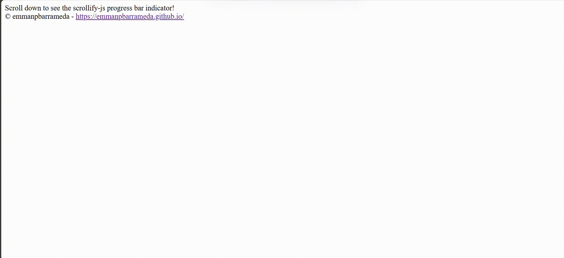
Scroll down to see Scrollify in action! <br />
© emmanpbarrameda -
<a href="https://emmanpbarrameda.github.io/" target="_blank" rel="noopener noreferrer">
https://emmanpbarrameda.github.io/
</a>
</div>
<script src="https://cdn.jsdelivr.net/gh/emmanpbarrameda/[email protected]/scrollify-scrollprogress-indicator.js"></script>
</body>
</html>Want to contribute? That's great! You can:
- Fork the repository
- Create a feature branch (
git checkout -b feature/NewFeature) - Push your changes (
git push origin feature/NewFeature) - Open a Pull Request
This project is licensed under the MIT License. See the LICENSE file for details.
If you find this project helpful, consider:
- ⭐ Starring the repository on GitHub
- 🐦 Sharing it on Twitter
- ☕ Supporting via PayPal: https://paypal.me/emmanpbarrameda
Visit My Portfolio

Check out my portfolio to learn more about me! 
|

|
Made with ❤️ by emmanpbarrameda