Bring responsive widgets to flutter! this package has some widgets to make a simple responsive ui
first, add responsively to your pubspec dependencies.
To import responsively:
import 'package:responsively/responsively.dart';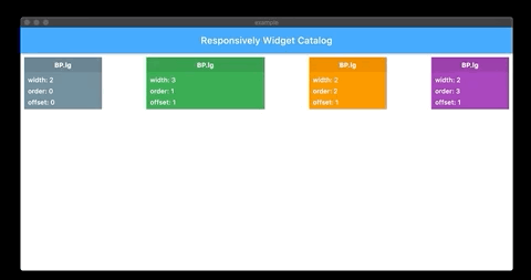
Responsive grid look like bootstrap grid, support width, offset and order for diffrent BreakPoints
ResponsiveRow(
 totalColumn = 12, // you can change total columns as you want
  mainAxisSpacing = 0, // horizontal column spacing
  crossAxisSpacing = 0, //vertical column spacing,
  mainAxisAlignment = MainAxisResponsiveRowAlignment.start, // horizontal alignment of columns
  crossAxisAlignment = CrossAxisResponsiveRowAlignment.start, // vertical alignment of columns
  @required children, // your grid columns
);- simple grid :
ResponsiveRow(
  children: [
    ResponsiveColumn(
      width: ColumnWidth(
        lgUp: 3, // fill 3 from totalColumn column in large screen and bigger
        mdUp: 4, // fill 4 from totalColumn column in medium screen and bigger
        smUp: 6, // fill 6 from totalColumn column in small screen and bigger
        defaultValue: 12, // if device size not exist in your definition defaultValue is your column width
      ),
      child: Container(
        height: 100,
        color: Colors.purple,
      )
    ),
    ResponsiveColumn(
      width: ColumnWidth(
        mdUp: 4, // just in medium screen and bigger fill 4 from totalColumn column, otherwise because defaultValue not defined fill totalColumn from totalColumn column in other screen sizes
      ),
      child: Container(
        height: 100,
        color: Colors.deepOrange,
      )
    ),
  ],
),
note :
ColumnWidth has many properties, all properties is optional, if there is no any value, defaultValue used, if defaultValue not defined, it's totalColumn.
list ColumnWidth properties :
ColumnWidth(
  int xs, // just in extra small size
  int xsUp, // extra small size and bigger
  int sm, // just in small size
  int smUp, // small size and bigger
  int smDown, // small size and smaller
  int md, // just in medium size
  int mdUp, // medium size and bigger
  int mdDown, // medium size and smaller
  int lg, // just in large size
  int lgUp, // large size and bigger
  int lgDown, // large size and smaller
  int xl, // just in extra large size
  int defaultValue, // fallback value
),- grid combine
orderandoffsetfeature :
ResponsiveRow(
  children: [
    ResponsiveColumn(
      width: ColumnWidth(
        lgUp: 3, // fill 3 from totalColumn column in large screen and bigger
        mdUp: 4, // fill 4 from totalColumn column in medium screen and bigger
        smUp: 6, // fill 6 from totalColumn column in small screen and bigger
        defaultValue: 12, // if device size not exist in your definition defaultValue is your column width
      ),
      order: ColumnOrder(
        lgUp: 0,
        mdUp: 1,
        smUp: 0,
        xsUp: 1,
      ),
      offset: ColumnOffset(
        lgUp: 2,
      ),
      child: Container(
        height: 100,
        color: Colors.purple,
      )
    ),
    ResponsiveColumn(
      width: ColumnWidth(
        lgUp: 3, // fill 3 from totalColumn column in large screen and bigger
        mdUp: 4, // fill 4 from totalColumn column in medium screen and bigger
        smUp: 6, // fill 6 from totalColumn column in small screen and bigger
      ),
      order: ColumnOrder(
        lgUp: 1,
        mdUp: 0,
        smUp: 1,
        xsUp: 0,
      ),
      offset: ColumnOffset(
        mdUp: 1,
      ),
      child: Container(
        height: 100,
        color: Colors.deepOrange,
      )
    ),
  ],
),
note :
ColumnOrder has many properties, all properties is optional, if there is no any value, defaultValue used, if defaultValue not defined, it's null ( computed by index )
list ColumnOrder properties :
ColumnOrder(
  int xs, // just in extra small size
  int xsUp, // extra small size and bigger
  int sm, // just in small size
  int smUp, // small size and bigger
  int smDown, // small size and smaller
  int md, // just in medium size
  int mdUp, // medium size and bigger
  int mdDown, // medium size and smaller
  int lg, // just in large size
  int lgUp, // large size and bigger
  int lgDown, // large size and smaller
  int xl, // just in extra large size
  int defaultValue, // fallback value
),
ColumnOffset has many properties, all properties is optional, if there is no any value, defaultValue used, if defaultValue not defined, it's 0
list ColumnOrder properties :
ColumnOffset(
  int xs, // just in extra small size
  int xsUp, // extra small size and bigger
  int sm, // just in small size
  int smUp, // small size and bigger
  int smDown, // small size and smaller
  int md, // just in medium size
  int mdUp, // medium size and bigger
  int mdDown, // medium size and smaller
  int lg, // just in large size
  int lgUp, // large size and bigger
  int lgDown, // large size and smaller
  int xl, // just in extra large size
  int defaultValue, // fallback value
),this widget give value by current BreakPoint
ResponsiveWidget<T>(
  ResponsiveWidgetBuilder<T> builder,
  ResponsiveInfo<T> value,
);ResponsiveWidgetBuilder<T> = Widget Function(BuildContext context, T value);ResponsiveInfo<T>(
T xs, // just in extra small size
T xsUp, // extra small size and bigger
T sm, // just in small size
T smUp, // small size and bigger
T smDown, // small size and smaller
T md, // just in medium size
T mdUp, // medium size and bigger
T mdDown, // medium size and smaller
T lg, // just in large size
T lgUp, // large size and bigger
T lgDown, // large size and smaller
T xl, // just in extra large size
T defaultValue, // fallback value
),- in this example when screen size is
lgUpcolor isColors.purple, when screen size ismdUpcolor isColors.deepOrangeotherwise color isColors.black
ResponsiveWidget<Color>(
  value: ResponsiveInfo(
    lgUp: Colors.purple,
    mdUp: Colors.deepOrange,
    defaultValue: Colors.black,
  ),
  builder: (context, color) {
    return Container(
      height: 100,
      color: color,
    );
  },
)- in this example when screen size is
mdUptextAlign isTextAlign.rightotherwiseTextAlign.left
ResponsiveWidget<TextAlign>(
  value: ResponsiveInfo(
    mdUp: TextAlign.right,
    defaultValue: TextAlign.left,
  ),
  builder: (context, textAlign) {
    return Text(
      "SAMPLE",
      textAlign: textAlign,
    );
  },
)this widget give current BP and you can build your UI by current BreakPoint
ResponsiveBuilder(
  BreakPointBuilder builder,
);
BreakPointBuilder = Widget Function(BuildContext context, BP breakPoint);example :
ResponsiveBuilder(
  builder: (context, bp) {
    if(bp == BP.lg) {
      return Text('YOUR ARE IN LG BREAKPOINT');
    }
    return SizedBox();
  },
),responsive SizedBox, width of SizedBox get by current BreakPoint
ResponsiveSizedBox(
  ResponsiveWidth width,
  double height,
  Widget child,
);ResponsiveWidth(
int xs, // just in extra small size
int xsUp, // extra small size and bigger
int sm, // just in small size
int smUp, // small size and bigger
int smDown, // small size and smaller
int md, // just in medium size
int mdUp, // medium size and bigger
int mdDown, // medium size and smaller
int lg, // just in large size
int lgUp, // large size and bigger
int lgDown, // large size and smaller
int xl, // just in extra large size
int defaultValue, // fallback value
),example :
in this example if screen size is lgUp, width is 50.0, if screen size is mdUp width is 40.0 otherwise 30.0
ResponsiveSizedBox(
  width: ResponsiveWidth(
    lgUp: 50.0,
    mdUp: 40.0,
    defaultValue: 30.0
  ),
  child: Container(
    height: 100,
    color: Colors.red,
  ),
),Default BreakPoint defined like a BootStrap
| width | |
|---|---|
| BP.xs | 0 <= w < 576 |
| BP.sm | 576 <= w < 768 |
| BP.md | 768 <= w < 992 |
| BP.lg | 992 <= w < 1200 |
| BP.xl | 1200 <= w < double.infinity |
but you can change it :
void main() {
  Responsively.instance.breakPoints = BreakPoints(
    xs: 576.0,
    sm: 768.0,
    md: 992.0,
    lg: 1200.0,
    xl: double.infinity
  );
  runApp(MyApp());
}