Add improved diagram for Sans superplexing? #16
Description
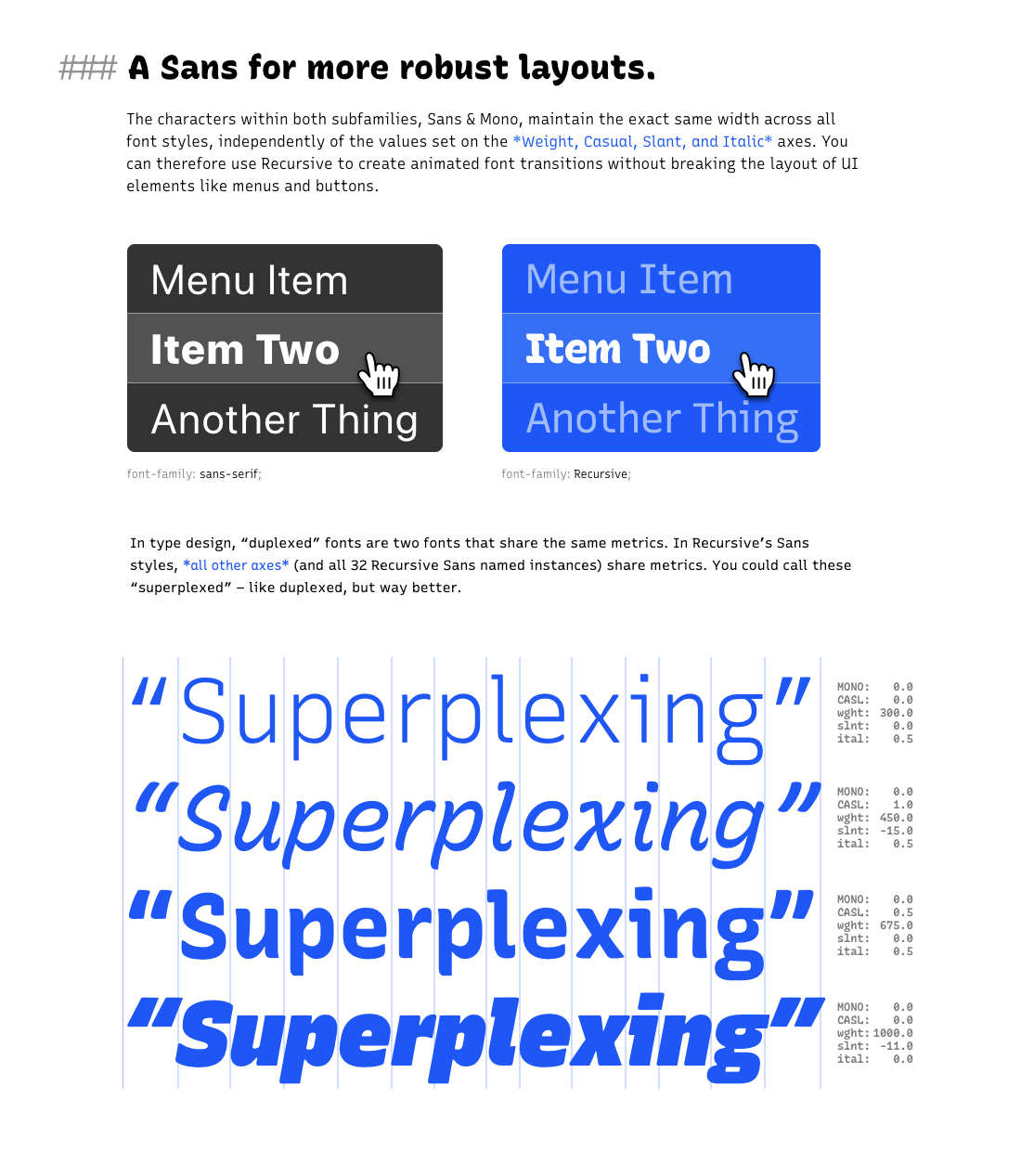
I wonder how many people realize what we're saying about the Sans, from just the small diagram of menus.
This is a pretty cool feature of the font, so we might call it out with a bigger, clearer diagram: